Tk20’s complete system redesign included all new elements and interfaces, as well as a complete restructuring of the information architecture. Experienced users of the old Tk20 system were so used to convoluted workarounds and non-intuitive user-paths to accomplish even the simplest of tasks. On the day that the UI switched over, these users were going to require some instruction, as well as reassurance that all their data was still available. This was a collaborative project between myself and another member of the UX team.
We faced many design challenges going into this project:
- Users would be first logging on and viewing the onboarding from all different pages, and the older back-end code base couldn’t pass information to our onboarding code about what page they were on.
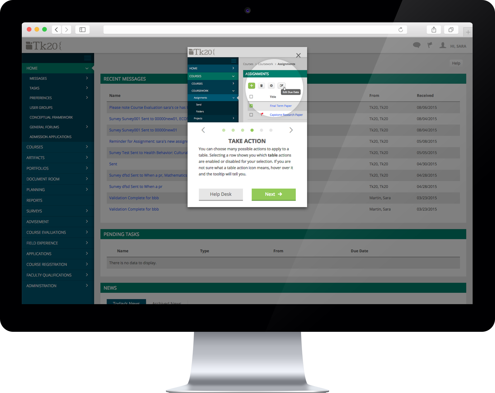
- Depending on the client, user role, and starting page, elements would be in different locations. Our onboarding couldn’t use any positional cues such as pointing to a part of the screen.
- Users would come to our onboarding with different levels of expertise: between 1/4 and 1/2 of them would be new users, so we couldn’t refer to any landmarks from the old system.
- We didn’t want to create information overload from the first page, because users also had a lot of new information and workflows to learn.
- Most users immediately close out of onboarding overlays without even reading the first word, but those users may find that onboarding information useful later.
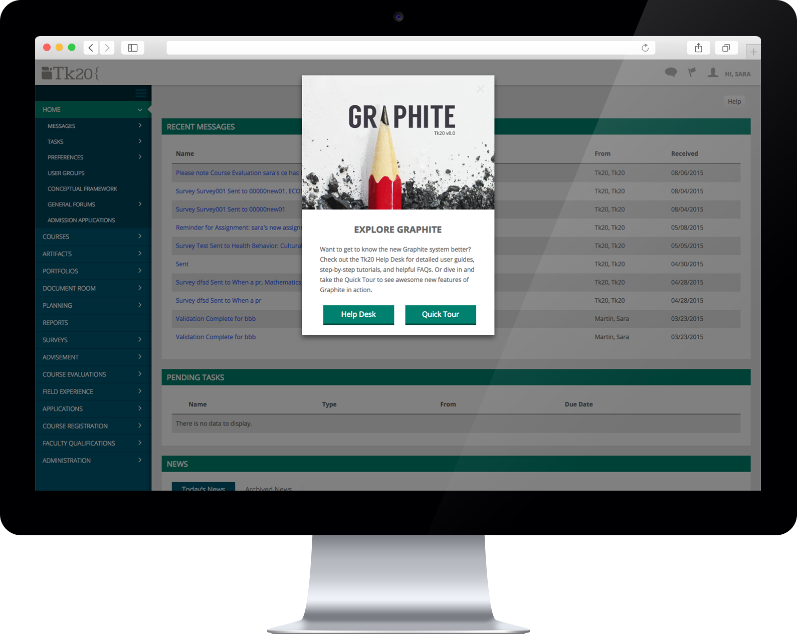
- Our old system used a “dumb” help button, which spit the user onto the front page of the documentation website. We wanted to create a smart button that knew what role and area the user was coming from to automatically direct the user to articles they were most likely to find useful.
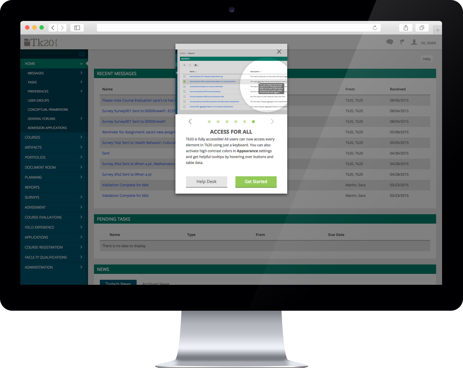
- The onboarding had a visual competent but needed to be equally understandable to blind users. This includes being fully and intuitively keyboard accessible.
Our final design tested well with users and was written to cover the most confusing workflows and new UI changes that a user might experience. When the user closes out of the onboarding overlay, a small unobtrusive but noticeable gif indicates that “we’re always here to help,” pointing out the help button. From the help button, the user can re-access our onboarding at any time, or click directly through to the documentation site for more detailed role- and task- specific user guides.