As the expert in UX I drove MultiplyMe’s design process, and my team used a non-hierarchical collaborative structure to vet design changes. Our process was iterative, each month we performed a complete redesign based on insights gained from the previous month. Research drove the design process.
- Extensive interviews of nonprofits: I created a list of open-ended interview questions to survey the nonprofits’ unmet needs, the extent of their internet presence, the demographics of their current donor base and their desired donor base, and their past experiences using online fundraising. We then interviewed one nonprofit per week and compiled the results.
- Survey of the competition: I identified our competitors, then followed the user flow of setting up a donation page and of donating to an individual campaign on each to identify commonalities (best practices) and innovations from the UX/UI of each of our competitors, as well as where they fell short.
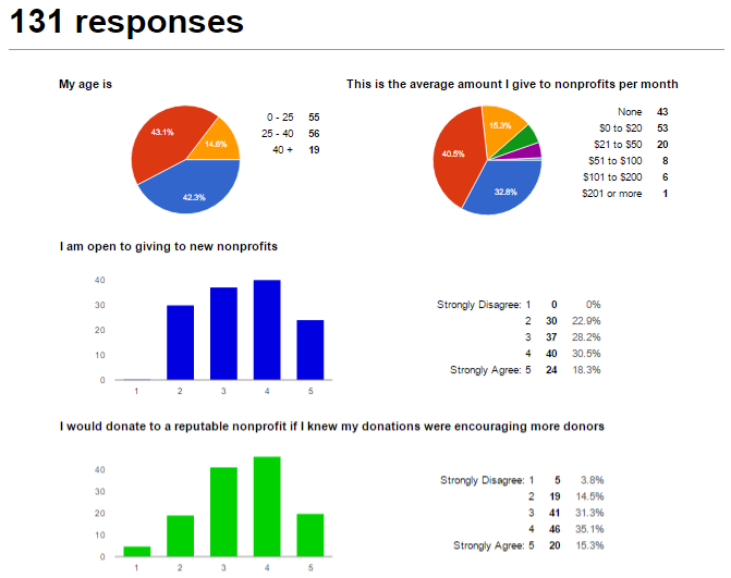
- End user surveys: After identifying our target demographic, we issued several surveys of members of those demographics, asking both multiple choice questions to specific problems and open ended long-form questions to find unexpected solutions. We were able to obtain responses from more than 200 members of our target demographics, which we analyzed to discover which features our target audience valued the most.
- Client Collaboration: For our first four campaigns we selected nonprofits to beta-test based on their willingness to collaborate on feature development. Throughout each campaign we met weekly with each client to identify key roadblocks as well as potential ideas for innovative new features.
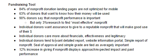
- Psychological Research: There is a substantial scientific literature on what motivates people to become donors, which we referenced extensively. Some key insights included creating donor illusions, time sensitiveness, social motivation, a non-stigmatized avenue for social sharing, and pushing ingroup (friend or family) referrals.
- Competitor Literature: We subscribed to best practices booklets and nonprofit fundraising guides from as many of our competitors as possible to utilize their existing expertise.
- On-site Analytics: We used a number of front-end and back-end metrics to determine the success of each page and feature.
I used this research to inform my UX deliverables:
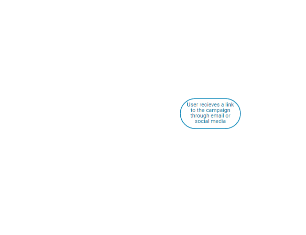
- User-flow mapping: I identified what key information needed to be presented to and which choices need to be determined by our end-users, then mapped the simplest possible user flow, including how these choices would be made and where options would be presented.
- User stories: based on input from our end user surveys and our nonprofit interviews, we generated hundreds of user stories that constituted test scenarios, which I added to after every trial and ran through before each monthly campaign.
- Wireframes, interactive prototypes, and visual mocks: in Sketch and Photoshop, I created and refined the visual presentation of our product.
- HTML/CSS/Javascript prototypes: as a proof of concept or as part of user research, I used Bootstrap and Angular to quickly generate testable pages.