As I continued to refine the system, I identified and implemented features that would make it as easy and appealing as possible for our end users to donate to these nonprofits. Features include:
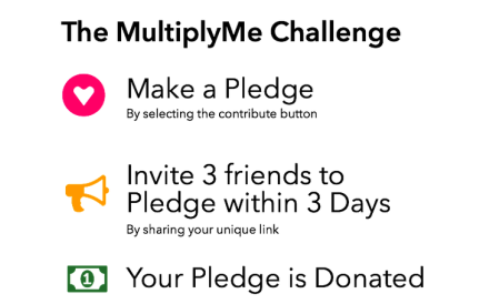
- User driven referral system: the MultiplyMe challenge turns each donor into a recruiter for more donors and allows nonprofits to tap into the social networks of their existing donor base. To complete the challenge, users needed to refer 3 friends within 3 days before their pledge was donated.
- Options: not everyone has the time or network resources to take the challenge. To these users, MultiplyMe offered the option of a more traditional immediate donation.
- Specific referral goals: initially, we thought it may have been better to leave the number of friends a user could refer open ended, but through user interviews and our psychological research we found that people were likely to refer more friends if given a specific and manageable goal. The goal of referring three friends was decided on after a demographic survey showed that a vast majority of potential users were confident they could find three friends willing to donate on their recommendation.
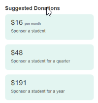
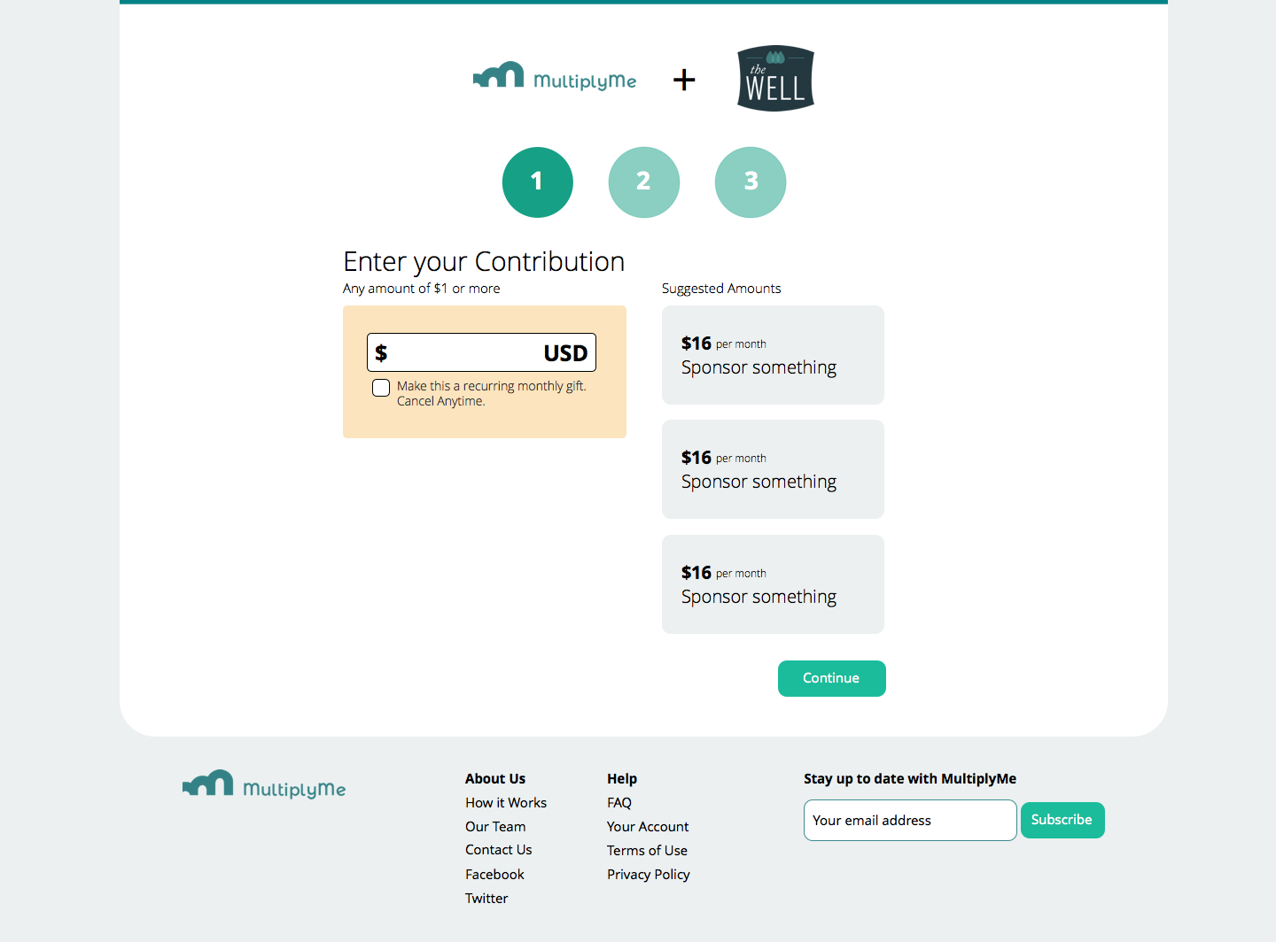
- Donor suggestions: based on results from psychological studies, we created a section on our page the mimicked the design of traditional crowdfunding’s Rewards section, to show suggested donations that matched a few examples of what uses the nonprofit might have for the donation. This strategy has also been used to great effect by other nonprofits such as heifer international.
- Three day time limitation: more urgent causes are able to raise more funds, faster. When a time limitation is added to non-urgent causes, donations received a huge boost. This is the principle behind the success of local “Day of Giving” fundraisers. Also, our analytics showed a steep drop in individual user engagement over time, with most users no longer engaged in referring new friends after three days..
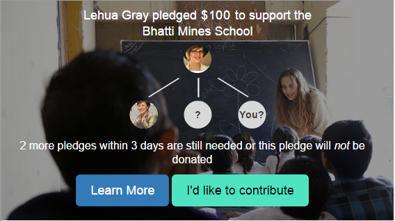
- Ingroup recommendations: our research, both of psychological literature and through interviews and surveys, showed that people were far more willing to give to a nonprofit when they knew their friends also supported the same organization. This effect persisted even when the user had never heard of the nonprofit before the referral.
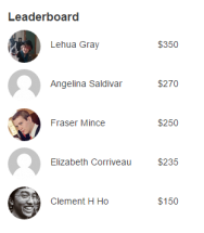
- Leaderboard and gamification: gamification, if successfully implemented, motivates people to engage. Our first trial leaderboard was a complete failure at this, because the earliest donors had consistently larger network effects than later donors. Research shows that if a gamified system presents unwinnable odds (such as for our later donors), participation and engagement are discouraged rather than encouraged. In our second and third trails, we tested alternative methods of generating a leaderboard and found that counting the value of only your donation and your first-generation referrals’ donations was most successful in increasing engagement.
- Social proof and personalization: we put our user’s name, donation amount, and picture (from Gravitar) directly on the first page that their friends would see. We planned but did not get a chance to implement a feature allowing users to put a personal message on their referral page so that they could specifically explain their engagement with the cause.
- Fully accessible: this shouldn’t be out of the ordinary, but after surveying our competitors we found that most weren’t fully accessible. This seems surprising given that the nonprofit sector includes many disability advocate organizations. In our interviews, fundraising managers for disability advocacy organizations said that they would not consider using a tool that wasn’t fully accessible, and that a majority of their donors had disabilities.
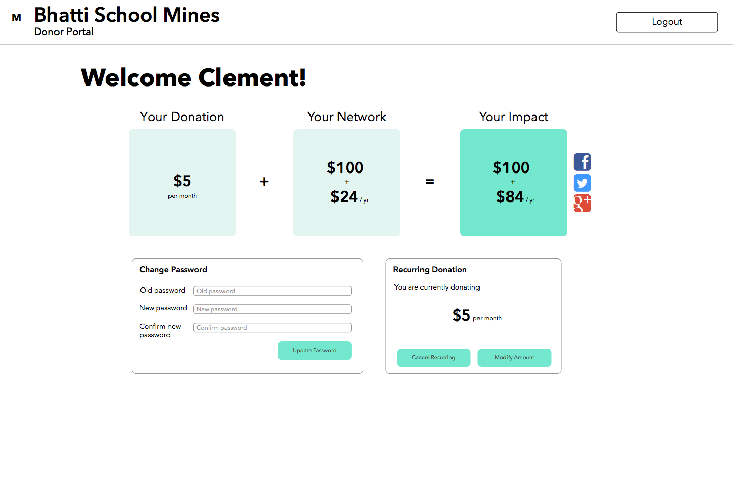
- Simple clear dashboard: after donating, the user needs to be able to access their account for a large number of reasons, including password changes, social sharing, or editing reoccurring donations. We redesigned the dashboard several times to clarify and simplify the actions that a user could take. (See screenshot above)
- Minimal steps/fields per page: after our surveys showed that target users put very high value in having a simple way to donate, we minimized the number of fields and put them all on a single page. However, we found that the one page caused information overload in our users, and we also discovered from our interviews with non-profits that they highly value information that helps them better tailor and target future fundraising campaigns. Based on this information, we broke down our donation flow into three smaller steps, each with only a few field and options.
- Social sharing: most people want to be thought of as charitable but don’t want to sound unhumble. Not only did we encourage social sharing, the structure of the challenge gave users an excuse to broadcast their altruism without it sounding like a “brag.” We also included tweets with pre-written content that the user could edit before posting, which increases the odds that people will post the tweet.
- Tailored experience: depending on whether you were referred by the nonprofit or a friend, your experience was different. We used specialized strategies to engage traffic based on the referral URL/origin
- Option for recurring donations: nonprofits have been pushing recurring donations lately, and younger donors are more likely to give as a sustaining giver, thus the success of sites such as Patreon. For our clients, the option of recurring donations was a huge selling point.
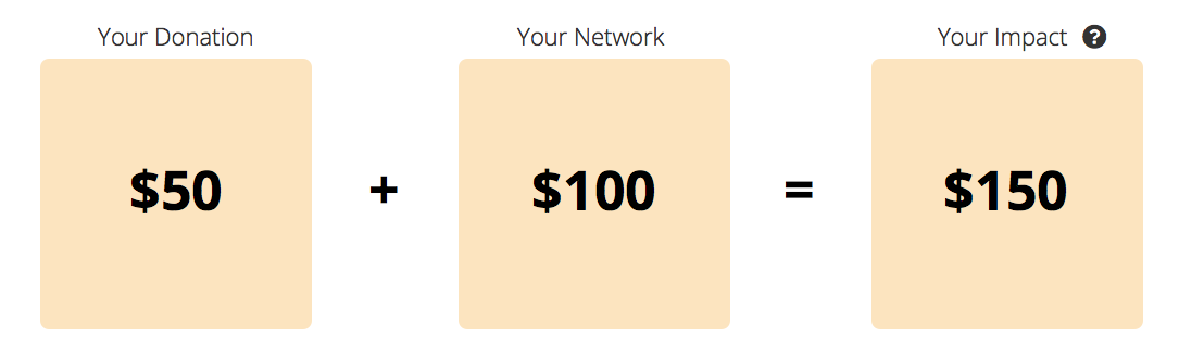
- Donation tracking: our dashboard allowed each donor to see their total impact, as well as the ability to see the names of friends who contributed based on their referral. We also included thank you emails that the referrer could sent to their donating friends with the click of a single button or edit to create a more personal thank you.
- Automated emails: smaller nonprofits don’t have time to send out thank you and reminder emails to each and every donor. Our system automatically personalized and sent those emails.
- Mobile: it goes without saying that targeting younger donors requires a completely mobile capable site. In fact our analytics showed that about a third of our donors used their cellphones to make their donation.